
The myth: “Email design trends are always useful”
In the world of email design, trends are everywhere. And if you’ve been here for a while, you know it’s one of our favorite things to talk about. We even hosted our first annual Email Design Trends with Really Good Emails last year.
Trends are fun. You’ve probably bookmarked a few or experimented with one in a campaign sometime in your email career. They’re a nice break in the mundane, something to look forward to. But their popularity doesn’t always mean they’re valuable or that they’d help us achieve a CVR we can brag about.
The truth is: Trends aren’t inherently useful. Not on their own, at least. Without strategy behind them, they’re just a little more decoration than usual. In this post we’ll discuss
- Why trends catch on
- Why understanding trends is more important than following them
- What to actually focus on
- And even dive into some “trends” we do recommend you follow
Let’s get into it.
Why Email Design Trends Aren’t Enough (and What to Do Instead)
Why trends catch on (and why that’s not a reason to follow them)
Trends thrive because they’re visible. When enough people do something like embracing a weird font, a moody feel, or going all in on colorblocking, it looks like best practice. But what we’re really seeing is common practice, not necessarily strategic thinking.
At best, following a trend shows you’re connected to the zeitgeist. At worst, it introduces unnecessary complexity and accessibility concerns. Subscriber trust is hard-won through consistency and relevance—you don't want to emulate a trend that's off-brand for you and do anything to erode that relationship.
The reality: Understanding trends is more powerful than following them
To be clear: we’re not anti-trend. Trends often reflect real shifts in user behavior or cultural context. They can serve as inspiration or reveal something deeper about what audiences want.
For example, in 2024, we saw an increase in raw and unfiltered photography. This showcases a desire for authenticity and simplicity. On the other hand, 3D text shows a need for people to experience a wow factor.
Understanding the why behind a trend is what makes it useful. It turns a visual style into a design principle.
Take the rise of the styled letter trend. Designed to look like personal notes, with handwritten-style fonts, paper textures, oversized signature blocks, maybe even a coffee ring in the corner. They’re nostalgic, warm, and ooze personality.
For many, the styled letter lacks the “wow factor.” It’s just a more tedious version of an all-text email.
But beneath the aesthetic, or lack thereof, the fact that this is trending reflects a desire for a human touch and emotional connection in the world of AI. For most of us, it's a nice, well-deserved break from the polished, brand-heavy tone of typical marketing emails. When done well, it feels like a conversation, not a brand broadcast.
How to make email trends actually useful
If you just add a cursive font to a stock image, you might not see the impact of the trend you were hoping for.
If you love a trend, learn from it. Borrow what’s useful.
But before you dive into “How do we make this look trendy?” ask yourself and your team: ”What problem is this trend trying to solve, and do we share that problem?”
Trends don’t come out of nowhere. They usually hint at something deeper—whether it’s a growing frustration, a shift in user behavior, or a rising audience expectation.
The styled letter trend, for example, emerged not because marketers suddenly fell in love with faux handwriting and notebook textures, but because email audiences were burned out by overproduced, impersonal messages.
When you can identify the underlying challenge the trend aims to solve, you gain creative flexibility. You can respond to your reader’s need in a way that fits your brand, voice, and message. You’re not being trendy. You’re creative problem-solving. The best part? You did so without having to go full stationery-core.
Here are some challenges and email design trends that can tackle them:
#1. They’re checking email on their phones (and bouncing fast)
The creative solution: Mobile-first design, vertical layouts, big buttons
By this point, you don’t have to be told that a good majority of your readers access your emails via mobile and that if your emails aren’t optimized for mobile, they’re gone. From a wonky layout to too-hard-to-tap CTAs, every element counts. Mobile-first design solves the usability issue, reducing friction by simplifying the structure and making every element easy to engage.
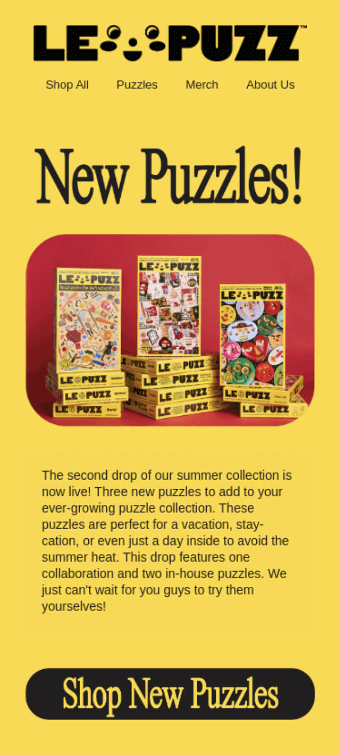
The following example from Le Puzz shows these principles in practice. It uses a single vertical layout with big buttons and good hierarchy to guide the reader to the end of the email. So, even if your readers skim the email, they understand its purpose.
They’ve seen it all (and tune out anything that feels like an ad)
The creative solution: Custom brand illustrations, short and sweet copy, colorful experiences
At this point, we can all spot a marketing message a mile away, and most of us are tuning out before the email even finishes loading. These elements create emails that feel less like a sales pitch and more like an experience. The visuals carry emotion. The copy respects their time. The design delights them.
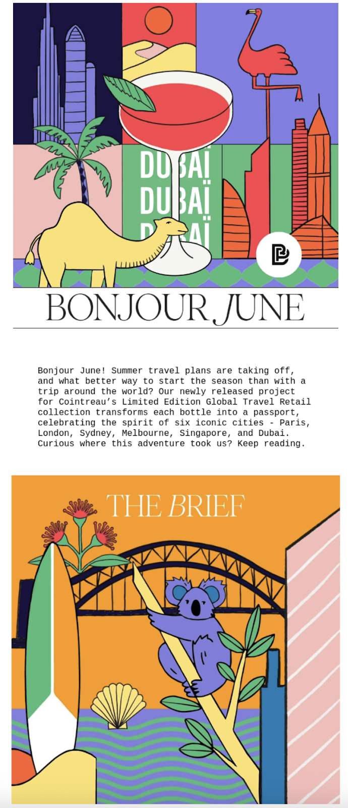
The deeper principle? Attention is earned, not assumed. And when everyone else is shouting louder, sometimes the smartest move is to be more intentional. The following email from Bonjour Paris incorporates all three seamlessly. Even without a CTA, the short copy, illustrations, and bold colors are enticing enough to keep us reading.
They’re overwhelmed with content and can’t find what matters
The creative solution: Modular layouts, oversized typography, and use of space
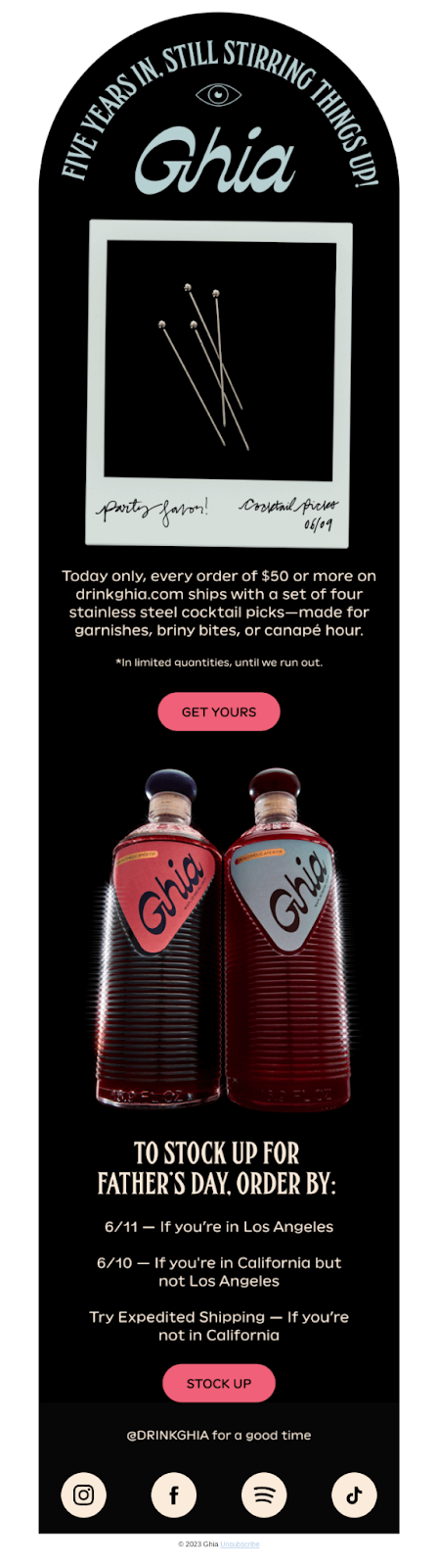
One reason why email design trends are usually not helpful is that they forget the basics. These solutions are classic design principles (contrast, hierarchy, and breathing room) wrapped in slightly more modern language. Ignoring them means cluttered layouts that fall apart in a real inbox. The following example from Ghia shows us that simple doesn’t have to mean boring.
Ready to start designing emails that perform, not just impress?
While design trends can be a great source of inspiration, they’re not a substitute for real strategy. What actually drives performance is clarity. Consistency. Flexibility. It’s systems over styles. Design that understands what your subscribers need and helps your team deliver it at scale.
Beefree equips your teams with the tools to bring your creative visions to life without compromising quality or email best practices. So the next time a new trend rolls through your feed, don’t ask, “Should we try this?” Ask: “Do we have the systems to support it?”
With Beefree, the answer is yes ;)
Since using Beefree...
I’ve gained valuable time to focus on developing innovative strategies for new campaigns and planning upcoming events.
The platform has streamlined my workflow, allowing me to work more efficiently and effectively. I can rely on Beefree with confidence, knowing it handles the execution seamlessly, freeing me up to prioritize creativity and forward-thinking initiatives. This has significantly enhanced both my productivity and the overall quality of my work.”
- Mohammed Jeelan S
Sr. Front-end Developer, Greytip Software Pvt. Ltd.
(source)
.webp)
