
Readersnaturally scroll to the bottom of an email—to the footer—when they're in search of more information, like where to find your brand on social media, how to update email preferences,how to contact your company, and more. Emails that follow design best practices and are like a teaser (clear and brief) will be lowon text and focused on a single call to action, makingthe footer the best location for fine print and additional details. Maximize this space by building a footer that's informative, well organized, clutter-free, andmobile optimized. In today's workshop, we'll show you how.
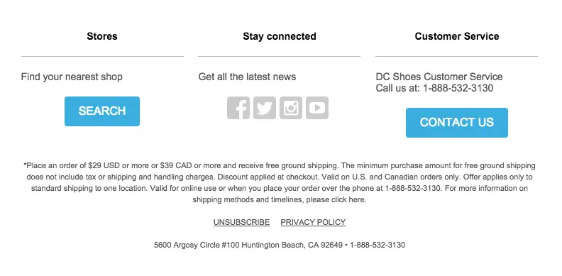
Inspiration for our email footer design
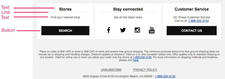
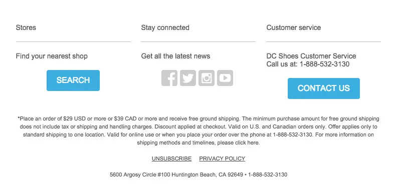
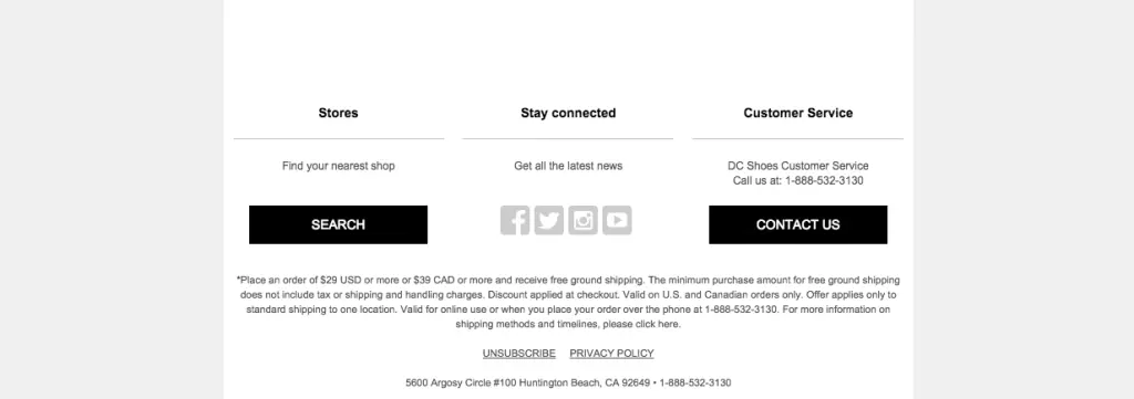
In our Best Practices for Email Footer Design post, we reviewed all the informationyou can and should (and sometimes must) include in your footer, along with best practices for formatting. One of the footerswe highlighted, from DC Shoes, is a great example of strong organization and a dynamic layout.
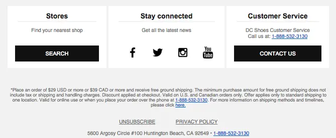
Usingheaders, HTML background colors, and a clean back-and-white color scheme is a great approach to optimizing space while improving readbility. The three-column layout is also mobile responsive, so text iseasy to read and buttons and links are easy to tap on a small screen.
In this post, we'll show you step by step how to create a footer like this using the BEE editor. Let's get started!
Tutorial: How to design your email footer
Here's our video recap:
Step 1: Set up the 3-column structure
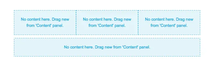
To recreate the structure of the footer in BEE, we'll usea 3-column layout, followed by a one-column structure for the fine print (*Place an order of $29... etc.). As always, we'll navigate to the Structure menu and drag-and-drop our selections into the body of the emailto get started.
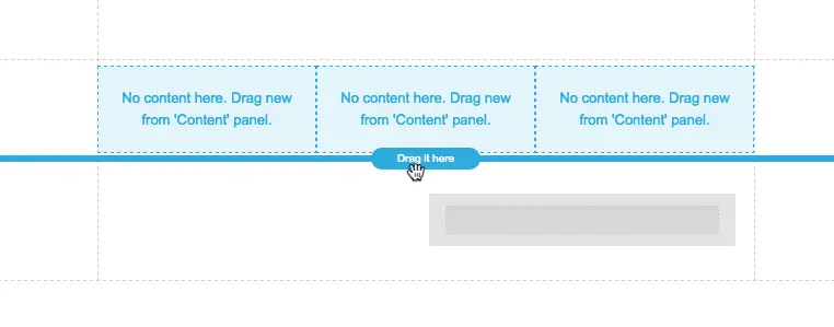
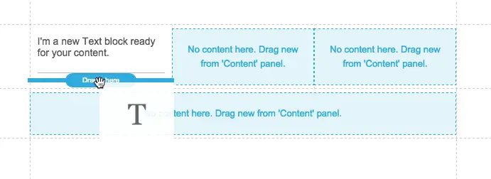
After dropping in our two structures, the layout of our email looks like this:
Step 2: Arrange content blocks
Each of the columns has the same basic structure: text, divider, text, then button/icons.
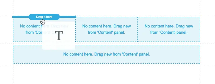
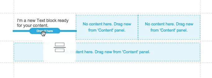
From the Content menu, we'll pull in each of these items to recreate the layout.First, text:
Then a divider:
Then text:
And then the button:
Here's our first section populated with content placeholders:
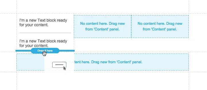
After we pull in the remaining items, the footer is prepped to customize and looks like this:

Note the center section has social sharing icons instead of a button. Check out our post on how to customize social media icons for a quick walk-through of how to select and format the look of these buttons in BEE.
Step 3: Customize and format text and CTA buttons
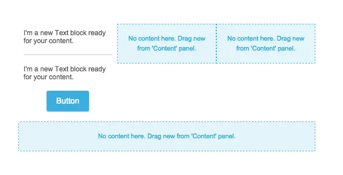
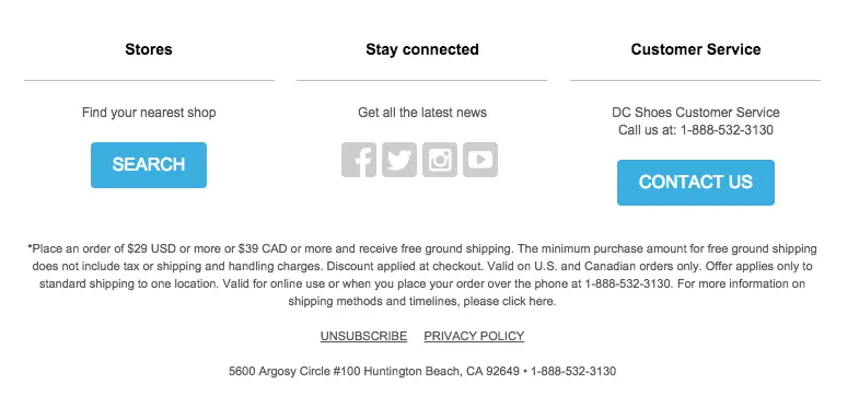
In each section, we'll customize the text. Before formatting, the footer looks like this:
First, we'll bold and center each header, and update the font color to black. The font typeand size looks good as-is.
Then we'll center the second lines of text and decrease the font size.
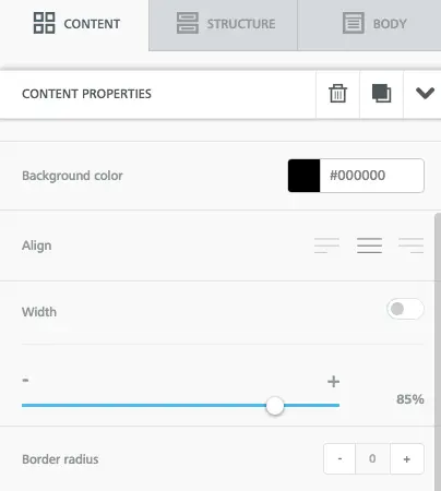
The CTA buttons also need to be customized.For each one, we'll...
- Change the color to black
- Extend to the right width (we chose 85%)
- Decrease border radius to 0 (for squared off corners)
Each of these changes is easily made in the Content Properties menu on the right:
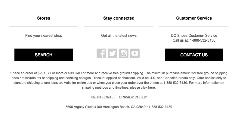
For an in-depth tutorial on CTA button formatting, check out our post How to design bulletproof buttons in email. Our customized buttons now look like this:
Step 4: Update the background color
To start creating the clear division of content from the DC footer, we need to update the row background color to gray, while the content background remains white. We can simply activate the row by clicking to the right or left of our content and updating the Row background in the Structure menu.
In the second row of content, where the fine print is listed, we will also make the Content background the same color as the row background.

We're getting close! If you're wondering how we can create divisions between each section, the answer is by adjusting the borders.Keep reading to see how.
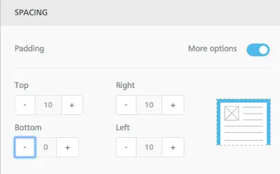
Step 5: Adjust borders and padding
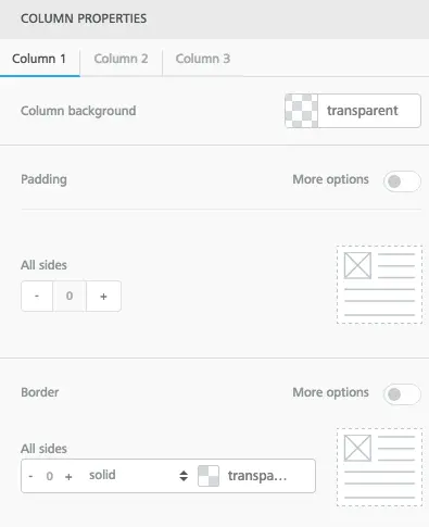
To create space between each section of content, we need to activate the row and check out the Structure menu on the right.Under Column Properties, there's a menu for each column tobe customized.
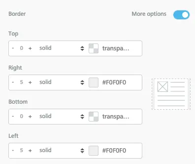
Select Column 2. Turn on More options in the Border menu. Now we can adjust the border around the center column on the top, bottom, left, and right. To create a gray border on either side, we can add one on the left and right.
Voilá!
The final step we'll take is to adjust the padding of the content within each section. For instance, each header should be closer to the divider beneath it to more closely mimic DC Shoes's format. We can select a header one by one and decrease the padding beneath it in the Spacing menu.
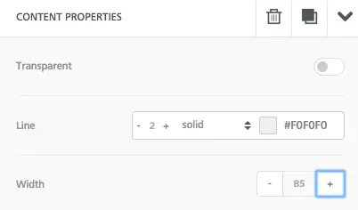
Then we can format the dividers themselves. Once its selected, the Content Properties menu allows us to adjust the thickness, color, and width of each one. In this case, we'll make each one thicker and the same width as the CTA buttons (85%) so they're aligned. We'll also change the color to match the background.
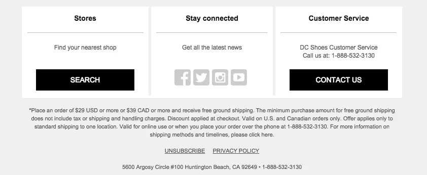
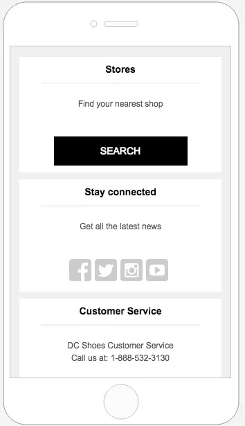
Here's our footer!

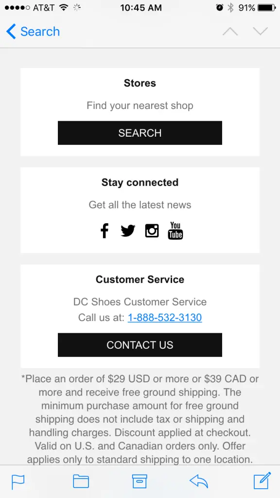
It's pretty amazing how closely it matches the original. To preview how it will look on a phone, we can select Preview from the Actions menu in the upper left corner.
Design a great footer and go Pro!
The DC Shoes footer isa great example of how smart design canmake a lot of content easyto scan, especially on a smaller screen. Witheffective use ofborders and a basic color scheme, the footer is elegant and well organized. If you're not already using BEE, sign-up for a BEE Pro free trial and have access to additional templates and design features.
